Monday, November 26, 2007

Unbirthday party

So this weekend, post-Turkey Day festivities, I made a meal for a friend who is bed ridden trying to keep her little one, Piper, in her cozy womb for another two weeks. I treated them to good old fashion Midwest comfort food--wild rice soup made with leftover Turkey Day turkey and challah. (Okay, no one in the Midwest eats challah except Jewish people, but whatever. It's SO YUMMY.) Plus I dug out the silly (so bad for you) chocolate cake recipe with the frosting that's 98.9% butter. Damn that cake is good, but it is SO not attractive. Whatever. Beauty, in this case, isn't only frosting deep.

I even pulled out my fancy decoration kit and frosted my way to this message:

In honor of Piper's up-and-coming arrival to the air-breathing world, I also knit her a hello present. She is not, however, allowed to come out and wear the hello present until she is fully baked. (see above cake message).

This year has been the year of the BOY (everyone is having boys) that I was thrilled to finally use up a bit more of my leftover colon yarn (from the knitted digestive system I made oh so many months ago). I'm all for gender ambiguity, but there's just no excuse for putting a baby boy in colon pink.
At long last, the hat and booties can be shown (hidden until now to remain a surprise to Piper's parents, the lovely Aaron & Elise.)

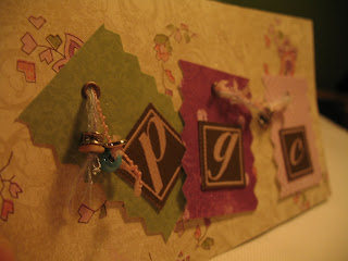
And because I'm a big show off, here's the front of the card. PGC are the baby's initials, ya'll. And you can't tell, but there is the CUTEST little bee charm dangling on pretty thread between the G & the C.

There are also a number of other really exciting things in the works, which I can't show you because it will ruin Santa's surprises. Alas, wait until December 26th. You can make it. In the mean time, go test your vocabulary AND feed some people here.

Monday, November 5, 2007

Type One: Grid Exercise III (final)


Finally! Here's number 4: must incorporate an image (either black and white or duotone).

This is the final point in the manifesto, and maybe my favorite. Also, I'm pretty proud of my use of the diagonal line in the grid. Oh yeah.

Tuesday, October 30, 2007

Doodles


more doodles from a very long staff meeting, including water bottles, cliches, and a couple of the decorated pumpkins from our office pumpkin decorating contest.


here they are in their final form-cut out and taped to a spiral bound notebook. It's my secret "doodle-book" and it makes me happy.
(you'll note that the green chairs are a repeat...that's cuz you viewed them in their native habitat below...here they are in their new, er, condo.)

Monday, October 29, 2007

Yarn!

Remember that sweater I promised I was working on? It's still true.


I'm making this one. But with a golden yellow instead of pink. It's hard because I get distracted by my life and forget to knit for awhile...even though it beckons from it's little sealed Rubbermaid bin. (never mind how dry it makes your hands...come and work on me!)


Here my armless chair is modeling my progress. Lookin good, eh? I've finished both sides of the front, the back, a sleeve, and the obi.


Check out that double seed stitch on the obi. What a gem.

Thursday, October 25, 2007

Type One: Grid Exercise II

I've got three done. I have now posted the Manifesto on the cupboard above my desk so that I can look at it all the time. It reminds me that I am not alone in the world, and that SOMEwhere there is a job for me where the office culture is pr0-creative.

Here you go: the first three both with and without the grid. :)

1. all of the type must be the same size, weight, and style.

2. you may vary the size, weight and style of type.

3. must be white or negative space dominant.

I love them, don't you? They look like those awesome "quote" cards you can buy in specialty stores...brilliant typography and only black text on a white square. Perhaps that's where this exersize came from. Perhaps.

Wednesday, October 24, 2007

doodles


Have you heard of Summer Pierre? She wrote the zine The Artist in the Office. I don't own it (yet) but there are a couple inspiring pages here.

One of the pages suggests keeping all your phone doodles in a sketch book. I'm doing it but with meeting notes (I try to avoid long phone calls at all costs). I just remembered that we have a pretty sweet copier/scanner here in the office, and I thought I'd share what I doodled yesterday at a seminar on our aging community.


I remember my mom (who is an artist in an office) telling me when I was a kid that "how to draw X" books weren't the best way to learn*. Starting with circles that lead to shapes that lead to dinosaurs wasn't as good as just drawing what you see. Practicing. So here are the water pitchers and water glasses and cups and saucers and chairs at the conference center.

*BTW...I recently had a conversation with someone at work about how she's not artistic at all. I think that is the lamest thing to say ever. (Mom, I know I used to say that too. But you told me I was wrong and you were right.) Drawing, painting, writing, etc. are all skills that can be learned. People get good at them because (typically) they like doing them and then they do them A LOT. Repetition repetition repetition. I'll rant more on this later. Just you wait.

Tuesday, October 23, 2007

Type One: Grid Exercise

My next assignment. This one is going to be fun! Click on the Incomplete Manifesto link for a GREAT list of rules to live by!

Problem:
Produce (4) 8”x 8” compositions that explore visual heirarchy and the control of emphasis on type, image, and space.

Elements: Each of your layouts should be striving for visual heirarchy and should be based upon a grid system. Each panel should include all of the following elements:
• (1) of the 43 points (except #5) from Bruce Mau's Incomplete Manifesto
• the # and heading of the above point
• the following credit “—an excerpt from Bruce Mau’s Incomplete Manifesto for Growth”

All typography will be limited to (1) font and it’s family members.
No display fonts.
I suggest choosing one of the following families:
Garamond, Bembo, Didot, Caslon, Futura, Gill Sans, Franklin Gothic, Helvetica, or Universe.

Use this same font for all three layouts.
You are limited to black for type color.
Compositional elements to possibly explore are:
union, subtraction, repetition, contrast (geometric + organic, dark + light, large + small etc.)

Layouts:
#1 all of the type must be the same size, weight, and style.
#2 you may vary the size, weight and style of type.
#3 must be white or negative space dominant.
#4 must incorporate an image (either black and white or duotone).

Process:
• brainstorming / free association lists—think about images your chosen point brings to mind
• thumbnails—at least 10 studies for each of the 3 compositions
• roughs—b+w at 100%

Presentation:
Each of your final compositions will be mounted on 8x8 foamcore.

Objectives:
To experiment with basic grid structures as formal layout guides.
To understand the idea of visual hierarchy.
To explore the shift in meaning and impact of a design resulting from formal compositional changes.
To understand how content and meaning are affected by the marriage of type and image.
To understand how contrast of elements leads to dynamic composition.
To teach a design process of thorough exploration.

Evaluation:
Exploration of layouts
Use of grid
Use of type
Craft

Monday, October 22, 2007

BYOP: I'll make the cake


YUM. Who made gingerbread with crystalized ginger and lots of mollasses AND a spicy applesauce cake with a brown sugar frosting? I did, ya'll. And they were YUMMY.
Posted by Picasa

Thursday, October 18, 2007

Good type, Bad type III

Okay, so my assignment is WAY overdue. But, hey, I'm not actually in the class. So it's all good. I've been busy baking bread, reorganizing my entire house, knitting a sweater, and preparing for the BYOP party.

The assignment for the Good Type Bad Type project required 10 thumbnail sketches for each type...but I've instead shot for three ideas (in a confident draft stage) for each.

This was until I had already created two posters for my bad font (Freestyle Script) which I now hate, mostly because the information I gathered about it led me to believe that there were endless contextual alternatives for its lowercase letters allowing one to make the font look just like real half-cursive handwriting. It's a lie, I tell you, a LIE. In fact, I hand kerned all those letters. In the interest of my sanity (along with a real concern for repetitive motion disorder from using my mouse button to click click click click click the letter pairs together in order to make them look like cursive) there's only two. (you'll note that my second Freestyle Script poster is almost mocking the font with its I-miss-the-eighties colors and its sad "freestylin'" headline. That's because I am angry with the font. In fact, as mentioned above, I hate the font.)

And yet, I'm not only hating. With the same vigor that I hate Freestyle Script, I love Minion Pro. Just look at those swashes and glyphs! And look at those serifs--so graceful, so strong, so lovely. It makes me want to design a wedding invitation so I can use it for reals.

Anyone getting married?


Tuesday, October 9, 2007

Challah!


I made my first bread. HOLLER! HOLLA! CHALLAH! When I visited my dear sister (and her darling baby boy) last month, she handed down generations of knowledge about yeast, like a little gift in a box (or pre-measured packet, if you will). Yes, dear reader, my sister and I made my Great Grandma Gladys's caramel rolls...an all day project that requires nothing if not TIME and patience. (And a willingness to be a slave to the rolls for the entire week it takes to consume them. And believe me, I'M WILLING.)

Anyway, I made my first yeast bread all on my own last Friday. And it was yummy. YUMMY.

And then, the next morning, my next door neighbor and I made french toast out of the bread (with a nutmeg pear compote). Yummier.

Monday, October 8, 2007

BYOP

Hey all you readers out there...happy fall!

In celebration of fall, Joe and I are having our traditional pumpkin carving party. Here's a little ditty I drew up in order to invite the invited. Sadly, we don' t have enough square footage for all of our friends...

also...more to come. I've been busy...so busy i haven't posted my new designs!

(and lest you think i'm an idiot and the invite is off balance...there was an additional line of text below the "joe and heather's place o fall fun" line spouting off our address. This kept things in balance and didn't allow for all that white space. In the interest of ensuring that my mother can sleep at night (she worries) I deleted that line just before posting. I'm sure you wily interweb users can find my address online if you try, but i'm not going to just hand it to you here.)

Thursday, October 4, 2007

Good type, bad type II

I did some reading (browsing) through the interweb of confusion and learned this:

typeface: a whole family of a given design

typestyle: an individual aspect of a typeface, such as bold or italics

font: something tangible, often described as a unit, or set of a typeface (the little metal letters in the wooden box). One guy referred to this as the thing that enables the printing of typefaces. Another person said that a font is a collection of letters in specific design (typeface) and style (typestyle) that include size, pitch, spacing, etc.

font family: sets of typefaces that belong (Helvitica Bold, Helvitica Narrow....part of the same family.)

Arf. this is harder than it looks. Stupid Microsoft teaching us font means the wrong thing.

Thursday, September 27, 2007

Typography: Good Type/Bad Type


Assignment: [with my comments in red]

You are going to be making a series of two posters (possibly three, but more on that later).You will be picking one classic typeface and one not so classic typeface (more of a font, really) blindly. Remember how we talked about the differences between a typeface and a font at the beginning of the semester? [no. i guess i'll have to do some research.]

Purpose: To familiarize self with typeface history, work more with Illustrator, explore various printing solutions, research typeface uses and poster design history. Another main objective: realize the difference between a typeface and a font and how you can produce something well designed with a not so well designed font.

Part One: Type Selection
You are the proud owner of two faces. These faces will be yours for the duration of this assignment. It is your responsibility to do applicable research with respect to your faces, such as who designed it, when it was designed, specific applications for the face (was it designed for a medicine bottle, road signs, specific document or product?). Know its historical and modern uses. You are to report back to the class in a brief presentation covering your findings. [hmm...I guess I get to pick my own fonts.]

Your good type is going to have a large family of fonts to choose from. You may use all of them. Your bad font will only have one font choice. Your are stuck with this and must utilize it to produce a skilled, elegant poster. You may, however, choose one other helper face to use for body copy or other secondary information when creating the bad font poster.

Part Two: Poster Exercise
You are to design a poster introducing each good type and bad face to an audience that has never heard (or knows very little) about them. The poster should highlight type flexibility, history etc. Use the alphabet (you may use its numbers and special characters) and some clever copy to relay your concept about each face. You may use illustrations that you create, but hold back. I don't want this poster to be too image heavy. Check with me before you start.

Make both of your final posters the same size. The size must be 11x17 or larger.

Due Dates:
Thursday, September 27th::intro assignment, research on typefaces, thumbnail sketches for both posters [whoa. that's today. i didn't get this assignment until today. good thing i'm not actually in the class.]

Thursday, October 4th::Meet with me to look at progress and ideas. Have at least 10 well rendered ideas for each poster. Presentation on typefaces-later upload progress to flickr.

Tuesday, October 9th::small group crit on posters. upload your posters to flickr.

Thursday, October 11th:: have all progress uploaded to flickr, pre-crit on PRINT OUTS of both posters and if any time is left over then use it to work!

Tuesday, October 14th:: both posters due

Thursday, September 13, 2007

Type 1: Logotype

Assignment: Homework
Homework: Create a personal Logotype. A logotype is different from a logo. Logotypes communicate purely through the use of type forms, type orientation, and type relationships. Do not make this a "Make a Word Do What It Says" exercise. For Thursday, I want to see 10 different thumbnails of your name. You may hand letter or use computer typefaces or a combination of both. Think conceptually, not literally when creating thumbnails that represent you. Remember, no imagery, just type.

Response:
A couple pages of stuff...with my final choice. While I love the script versions (top left corner of the second set), I didn't feel like they were very "me." I finally settled on a version that is a bit more stylized...something with cool typography and a little fun thrown in at the "r". Comments/critiques are always welcome.

Tuesday, September 11, 2007

Type 1: Music Postcard Assignment

Assignment:

Pick a song lyric and design a postcard. Convey the meanings and/or feelings of a musical lyric through type. Think about literal, connotative and historical meanings of your lyric. The typeface characters may not be manipulated in any way (NO PHOTOSHOP FILTERS•DO NOT STRETCH TYPE). You may not add any graphic elements. To convey your lyric’s meaning think about size, placement on the page, orientation, direction, and typestyle. Remember that there are two sides to a postcard, make sure you create both.


OBJECTIVES:

• to analyze appropriate fonts for interpretive value.

• to encourage the use of type exclusively to convey an idea.

• to introduce type as a visual-communication medium

• to encourage thinking of type as an interpretive, expressive medium


Response: (click to enlarge)


close up of back side text block below