Ever wanted to add some flair to that letter wall* you've started? How about with a HUGE letter X? Now with step-by-step instructions:
THE STEPS:
1. Pick a typeface you heart. We picked Bodoni.
2. Pick a letter. We picked X. It's anonymous, not too flashy, and it sports a super sweet series of straight lines through most of its length. (Straight, I dare say, is easier than round.)
3. Open Illustrator and create a document with the dimensions of the letter you want. Ours is a little over six feet tall. (That's a lot of inches, ya'll.)
4. Type your chosen letter in your chosen typeface, create outlines, and resize to the proper height. (I want so badly to make an x-height joke here.) To save on laser printer ink, I turned the X into a stroke only--only an outlined X.)
5. Print--using crop marks. Ours was something like 183 pages. But there wasn't ink on very many of them. Later, I took all the blank pages and put them back in the printer. Never fear.
6. Line up and tape together. This part is hard, because printer margins all run a bit differently. If you were super TYPE-A you would get your paper cutter out and cut all the edges at the crop marks and then tape together. If you were me, you'd just eyeball it because you like the risk. (also, watch for dogs. They LOVE to walk on projects that have been layed out on the living room floor. They also love to lay down in the CENTER of such projects.)

7. Now. Here's where I'm going to tell you what we did, and then tell you to do it differently. We got out our cutting mats and X-acto knives and cut the X out of the center, leaving an enormous X stencil. Were I to do it all over, however, I would cut the X out of the center, leaving the X in-tact, creating a positive X...mostly because it's more sturdy to work with the bulk of a huge letter than the wobbly edges of a huge letter. And also because our big dream of putting the stencil on the wall and then just painting over it with rollers was NOT to become a reality.
7.5. Pause to notice that the serif on the Bodoni X looks a lot like a long nose. Pose with said nose.

8. Take the X positive or negative and tape in place on wall. Use the step stool. Try not to scream at your partner. This part takes patience because the weight of the paper really likes to listen to gravity and fall over.

9. Trace. (Joe's adding pencil lines to some parts we didn't trace strongly enough.)

10. Tape. At this point you're going to be jonesing to just start painting, but trust me, you'll thank yourself later if you take the time to tape the edges now.

11. Paint. We used three coats of Ralph Lauren metallic silver paint (free from our neighbors) and we probably should have used a fourth coat but we got impatient and ripped the tape off. Plus, like I said, we like a little risk. And we scoff at perfection. So there.

12. Take off the tape.
13. Clean up the edges. If you have textured walls, and we do, the paint will have bled a bit in places. We cleaned up the most egregious errors with white paint, but left some of the more subtle blurs in homage to how a letterpress or typed letter will bled ever-so-slightly when pressed into porous paper.
14. Add letters. Play with placement. Debate, rearrange, add more.

*(What letter wall?) Oh you know, us typofiles are all doing it. In fact, after we started ours, I found out that hula seventy has one. I've seen them elsewhere, too, but can't seem to find any links.
Alas, our letter wall is a collection of three-dimensional letters collected from old signs, old buildings, and the like. I find them on-line, in antique and junk stores, and even in some new spots (I'm okay admitting that's where we got our super rad F).
Alas, our letter wall is a collection of three-dimensional letters collected from old signs, old buildings, and the like. I find them on-line, in antique and junk stores, and even in some new spots (I'm okay admitting that's where we got our super rad F).



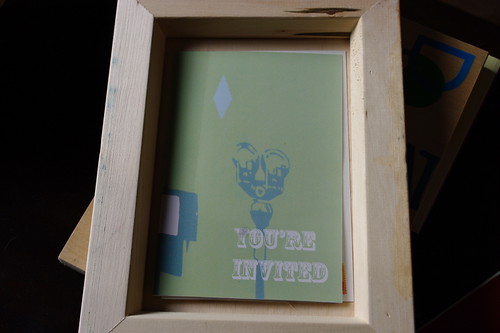
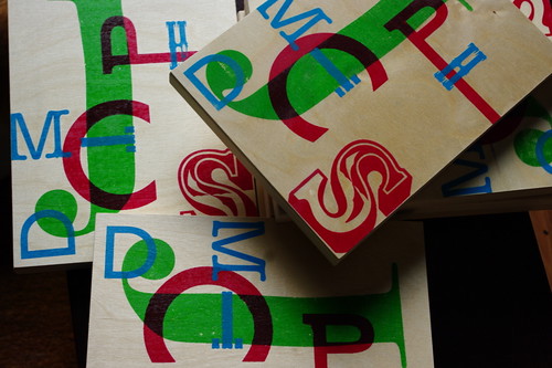 Curio No. 1. Three layer screen print on wood.
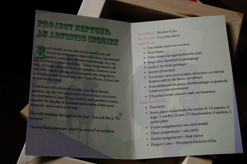 The invitation and rules.